 Spring came back with quite a pocketfull of
change (the currency exchange booth at Miami International Airport would
only exchange bills, not coins). On the drive back we talked a bit about
foreign
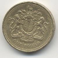
currency and the topic of British money came up, of which she had a few
coins (a new penny, two pence and two single pound coins).
“I wonder if Queen Elizabeth can
use this for identification,” I said, holding up one of the coins. Spring
giggled at the thought (“ID?” “Here you go,” the Queen says, handing him
a few pounds. “Right then, in you go!”)
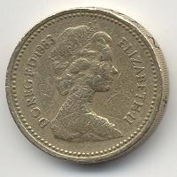
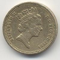
 I noticed though, that the portrait of the Queen has changed over the years.
On the earlier coin (1983) she appears younger, with a smaller crown than
the more recent coins (1993). Also, the pound coins feel and look more like
tokens than coins to me (they're actually quite thick, about the thickness
of two U. S. pennies, and slightly larger in diameter) and for their worth,
they're quite small in size (the two pence coin is slightly larger than the
U. S. quarter).
You have my permission to link freely to any entry here. Go
ahead, I won't bite. I promise.
The dates are the permanent links to that day's entries (or
entry, if there is only one entry). The titles are the permanent
links to that entry only. The format for the links are
simple: Start with the base link for this site: https://boston.conman.org/, then add the date you are
interested in, say 2000/08/01,
so that would make the final URL:
https://boston.conman.org/2000/08/01
You can also specify the entire month by leaving off the day
portion. You can even select an arbitrary portion of time.
You may also note subtle shading of the links and that's
intentional: the “closer” the link is (relative to the
page) the “brighter” it appears. It's an experiment in
using color shading to denote the distance a link is from here. If
you don't notice it, don't worry; it's not all that
important.
It is assumed that every brand name, slogan, corporate name,
symbol, design element, et cetera mentioned in these pages is a
protected and/or trademarked entity, the sole property of its
owner(s), and acknowledgement of this status is implied.

 Spring came back with quite a pocketfull of
change (the currency exchange booth at Miami International Airport would
only exchange bills, not coins). On the drive back we talked a bit about
foreign
currency and the topic of British money came up, of which she had a few
coins (a new penny, two pence and two single pound coins).
 I noticed though, that the portrait of the Queen has changed over the years.
On the earlier coin (1983) she appears younger, with a smaller crown than
the more recent coins (1993). Also, the pound coins feel and look more like
tokens than coins to me (they're actually quite thick, about the thickness
of two U. S. pennies, and slightly larger in diameter) and for their worth,
they're quite small in size (the two pence coin is slightly larger than the
U. S. quarter).

![Glasses. Titanium, not steel. [Self-portrait with my new glasses]](https://www.conman.org/people/spc/about/2025/0925.t.jpg)