The Boston Diaries

The ongoing saga of a programmer who doesn't live in Boston, nor does he even like Boston, but yet named his weblog/journal “The Boston Diaries.”

Go figure.

Sunday, Debtember 08, 2002

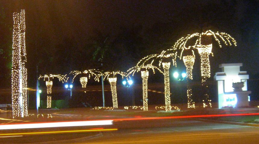
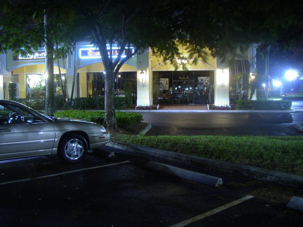
Directors commentary on “Enlightened Palms”

I'm not really thrilled with how Enlightened Palms turned out; I think Deserted Shopping Center in West Boca at 2:30 am turned out much better. Enlightened Palms is too washed out and grainy whereas Shopping Center is crisper.

I set the digital camera for night shots, indoor (artificial) lighting, no flash and an effective film rating of ASA 400, which as films go, means it's a fast film. It's the speed of film I used in college and I've had good results in using it at night, so I decided to use that setting here. Only the digital camera gives rather poor results with ASA 400 at night; very grainy and black areas tend to be a very blotchy bluish-black (which is more noticable on the original 1984×1488 images).

For Shopping Center (which was taken when I headed back to the car) I decided to see what the results would look like if, keeping the other settings the same (night shot, indoor lighting, no flash) and set the ASA to 100. The results I think look much better, so I'm thinking of doing another attempt at Enlightened Palms in the near future.

Obligatory Picture

[The future's so bright, I gotta wear shades]

Obligatory Contact Info

Obligatory Feeds

Obligatory Links

Obligatory Miscellaneous

You have my permission to link freely to any entry here. Go ahead, I won't bite. I promise.

The dates are the permanent links to that day's entries (or entry, if there is only one entry). The titles are the permanent links to that entry only. The format for the links are simple: Start with the base link for this site: https://boston.conman.org/, then add the date you are interested in, say 2000/08/01, so that would make the final URL:

https://boston.conman.org/2000/08/01

You can also specify the entire month by leaving off the day portion. You can even select an arbitrary portion of time.

You may also note subtle shading of the links and that's intentional: the “closer” the link is (relative to the page) the “brighter” it appears. It's an experiment in using color shading to denote the distance a link is from here. If you don't notice it, don't worry; it's not all that important.

It is assumed that every brand name, slogan, corporate name, symbol, design element, et cetera mentioned in these pages is a protected and/or trademarked entity, the sole property of its owner(s), and acknowledgement of this status is implied.

Copyright © 1999-2024 by Sean Conner. All Rights Reserved.