Thursday, August 15, 2002
FÖR SVERIGE I TIDEN
More European coinage. This time from Denmark and Sweden.
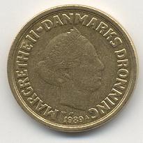
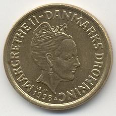 It seems that Queen
Margrethe II of Denmark decided to keep up with the
Windsors' and in the period between 1989 and 1998, updated her image from
her younger days to a more current likeness, while upgrading the crown she
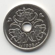
was wearing. It's also interesting that some of the lower value coins from
Denmark have holes in the middle, although I'm unsure of the exact purpose
of such holes. Perhaps they were used to store coins on strings?
Decorative? Not enough metal for coinage in the past? Who knows?
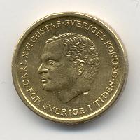
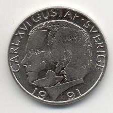 Sweden's Carl XVI
Gustaf has forgone the crown (at least in 1991) but did sported two
different looks—a conventional likeness on the 10 Kroner but an odd, early
70s android look for the 1 Kroner. At least, that's how it struck me when I
first saw it.
Another recurring theme on Swedish and Danish coins are crowns. Lots of crowns. That, and the recurrence of hearts on Danish coins. Very odd to these American eyes. But unlike the British pounds, these coins all feel like coins.

![The future's so bright, I gotta wear shades [The future's so bright, I gotta wear shades]](https://www.conman.org/people/spc/about/2023/1023.t.jpg)